Tips For Designing Good Dashboards

Designing a dashboard is one of the most crucial components for data representation. A good dashboard can greatly impact any company by uplifting productivity and increasing efficiency. Vise-versa, a bad dashboard could ruin a company, misleading business heads and workers and creating chaos. Therefore, the need for a well-designed dashboard must be balanced. Here are a few points that can help anyone make a good dashboard.
Know the users of the Dashboard
Before developing a dashboard, one should know and understand the users of the dashboard very well.
Ask yourself: Who am I designing the dashboard for? Why do they need it? And What is their level of understanding of the subject matter and data? If the dashboard is being used by higher-level managers, they would be interested in KPIs and macro level Charts rather than superficial entry data levels or tables.
Make proper use cases of the available data
Before the actual development of the dashboard, make a comprehensive use case of the available data. This helps choose the right visualization/charts to present the data and helps to display relevant data to the user.
Utilize the entire space on the dashboard
Try to avoid leaving blank spaces in your dashboard. If the dashboard is visually organized, users can easily find the information they need. Poor layout forces users to think more before they grasp the point, leading to time delays for decision-makers.
Here is an example of a dashboard showing the charts and KPIs that are properly organized with no blank space in it.
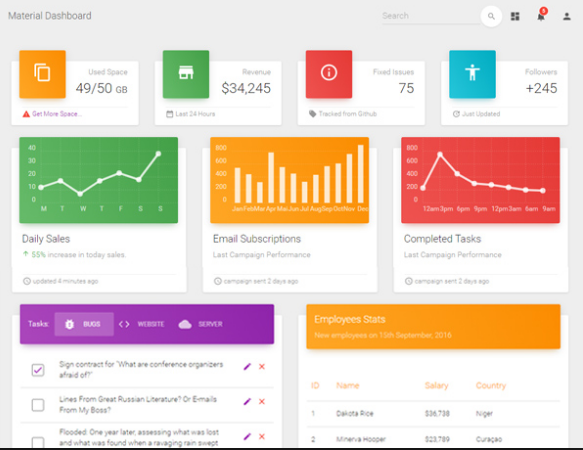
Figure 1
KPI’s and chart placement
The general rule of thumb is to keep the important KPIs on the top left of the dashboard. Most people start scanning the dashboard from the top left of the screen. Thus, grouping the various charts correctly is vital.
Example: If a dashboard displays Marketing and Sales data on the same tab, then make sure there is a need for. Don’t mix the charts showing Marketing data with Sales data on a single tab unless you want to show any comparative analysis.
Tool-tips
Make sure to add a tooltip in each visualization and chart. This helps the user understand the chart better and makes the dashboard more intuitive. When the user hovers over the chart, you can provide additional information in the tooltip.
In the image below, additional information is given in the tooltip
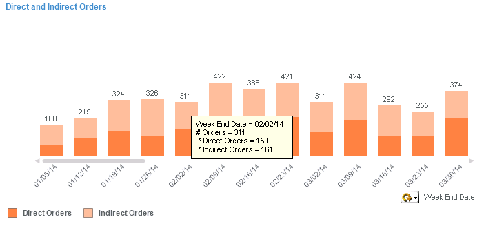
Figure 2.
Be consistent with money or number formatting
Ensure that the numbers displayed in the charts have the same formatting in all the subsequent charts. Keeping the same numbering system throughout the dashboard will help users understand the data faster. Different numbering systems in the same dashboard can lead to miscalculation by the users.
Example: If one chart shows values in Millions, make sure that the other charts don’t show values in thousands or billions unless required. If you are showing values up to 2 decimal points, follow through with it and be consistent throughout the dashboard.
Use of colors
If properly used, color’s role in a dashboard for conveying meaning could be invaluable but if badly used, color can be confusing and even misleading. Always be consistent with the use of colours. Color coordination throughout the dashboard should be the same.
Example: If green and red are used to denote “good” and “bad” in one chart, they shouldn’t be used to denote anything else in any other chart on your dashboard. Using limited colors is also recommended. Excessive use of many colors can create visual overload and get in the way of analysis.
In the image below, only two colors tell about the goals achieved and pending.
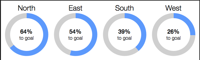
Figure 3.
Help text and Information page
Always provide an information/Index page at the beginning of the dashboard. Don’t assume your user knows where to start interacting with your dashboard. Help text for each chart gives the user an idea about what information you are giving in that chart. This makes it easier to understand to the user.
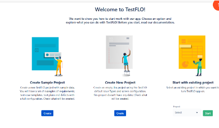
Figure 4.
Provide context in the Dashboard
How will you know whether the numbers are good or bad? or Whether they are normal? if there is no context. Without comparative values, numbers on a dashboard are meaningless for the users. And more importantly, they won’t know whether any action is required. Always try to provide maximum information, even if some may seem obvious to you. Your audience will not find it confusing. Name all the axes and add titles to all charts. This is very important and helps with comparative values.
Check how your dashboard looks on different devices
The context and device on which users regularly access their dashboards will directly affect the style of the information. Check how the dashboard looks on other devices like laptops, tablets, and smartphones. Remember to build dashboards that will fit all types of screens, whether a smartphone, PC, or tablet.